Throughout the years, Microsoft’s DOS and Windows operating systems have gone through various iterations. The first Windows was just DOS wrapped in a graphical user interface (GUI). Then, Windows 95 merged with DOS to produce a new operating system, although it omitted important security features. With Windows 8, it attempted to incorporate smartphone features, failed, but essentially made third-party anti-virus software obsolete.
Then, Windows 10 came, and it seemed like the best Windows of all. Windows 10 improved security by including new features. It also added a better digital assistant, Cortana, albeit only a few people ever used it. And even Microsoft said there would be no more versions of Windows coming after it. Well, that was until they changed their mind.
Today, Windows 11 is here, and Windows 10 users have the opportunity to upgrade to the latest OS. However, because Microsoft is rolling out the update in stages, not everyone will be offered it right now.
Windows has evolved and come a long way from where it was before.
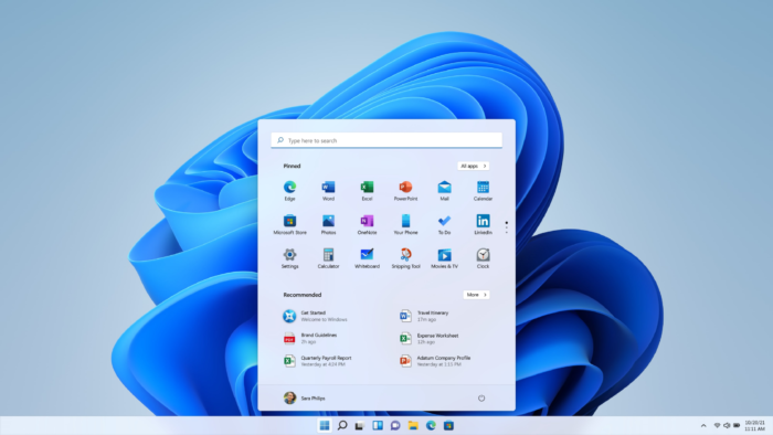
Windows 11 focuses on three important things: a new and modern user interface designed to make using Windows easier, new features and adjustments to increase productivity, and a renewed emphasis on the Microsoft Store. There are also new animations, icons and sounds which makes the experience fascinating and fresh. Everything from the Start menu and taskbar to the context menus has been modified to match the rest of the new Windows 11 design.
One of Microsoft’s priorities with Windows 11 has been to simplify and declutter the user experience (UX). Microsoft is attempting to make the Windows UX more user-friendly for casual PC users who are more familiar with modern OS experiences such as iOS and Android. So, the good news is that Windows 11 will be a fantastic version for individuals who favour simplicity. It’s easy to use, with an almost perfect fluid UX.

However, upon first glance, Windows 11 appears to be a significant departure from the familiar Windows 95 desktop architecture. The taskbar is still present, but all of your icons are now centred by default. The Start Menu has been revamped with pinned and recommended programs. There are rounded corners on app windows now; Windows Explorer, the Settings app, and even the sound effects are sharper than before. The start menu and taskbar have also been repositioned in Windows 11. They are now centred at the bottom of the screen instead of to the left. It feels new and yet it’s still the Windows we know and trust. There may be obvious differences in both aesthetics and user interface, but it’s just Microsoft’s way of making everything more streamlined than Windows 10.
All in all, Windows 11 has a lot going on. Most casual and mainstream users won’t notice much difference, but power users will appreciate some of the new features. It is a subtle shift from Windows 10, but it’s still a shift in the right direction.
What do you think? Are you loving the new Windows 11?


